Construction Progress Mapping
Jul 2022
Problem
While working on a large-scale pipeline construction project I noticed that the Project Controls team distributed a rather large and convoluted spreadsheet to show progress. This spreadsheet was incredibly difficult to read and many thousands of lines long. It referenced chainage (distance from the beginning of the project in meters) to indicate which areas were completed.
Unless someone was intimately familiar with the project and knew the chainage of every feature of note, the spreadsheet was not very useful.
Additionally, the scope of this project was divided among a few different contractors who reported their progress in differing formats.
Solution
I applied my skills in data analysis and geospatial mapping to distill the various spreadsheets into a simplified form, then converted that data into several easy-to-understand maps with multi-coloured lines and a clear legend.
Implementation
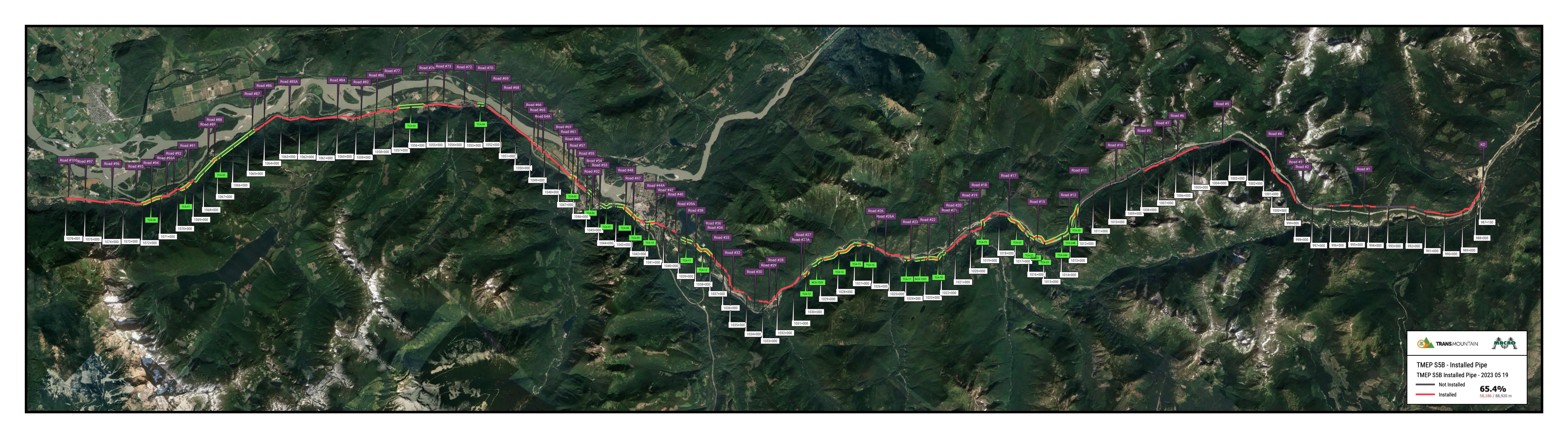
As the project is linear in nature, the progress is recorded by chainage chunk i.e. from 1050+050 to 1050+100. For each of these chunks there are a couple dozen crews that must complete their work there, always in the same order.
For instance, the clearing crew must pass over that chunk to remove the trees, then the grading crew after that to flatten it out, then the stringing crew to lay out the pipe, and then a welding crew to weld it together and so on.
Language
The script is written in Python to take advantage of the excellent Pandas, Geopandas, and SimpleKML libraries. Pandas and Geopandas are incredibly powerful data manipulation tools for working with tabular and geospatial data, respectively. SimpleKML is a lovely library for generating KML files which can be opened in Google Earth or imported into Google Maps.
Homogenization
As there are four different data sources for different aspects of the project, I needed to homogenize the data. I chose to continue with the progress chunk method.
Each data source is converted into a dataframe with columns for each crew type and rows for each distinct chunk of the project. Completion is indicated by a 1 or 0. For example:
| KP_beg | KP_end | clearing | grading | stringing | welding | ditch | lower-in |
|---|---|---|---|---|---|---|---|
| 1000 | 1100 | 1 | 1 | 1 | 1 | 0 | 0 |
| 1100 | 1200 | 1 | 1 | 1 | 1 | 0 | 0 |
| 1200 | 1300 | 1 | 1 | 1 | 0 | 0 | 0 |
| 1300 | 1400 | 1 | 1 | 1 | 0 | 0 | 0 |
| 1400 | 1500 | 1 | 1 | 0 | 0 | 0 | 0 |
These four homogenized tables are combined using a greedy-algorithm to determine the level of completion for every inch of the project.
Using this clean data, it is much simpler to produce maps and other analyses.
Mapping
By filtering for certain crews in the dataset, a point in the construction timeline can be displayed. for instance, pipe installed in the ground.
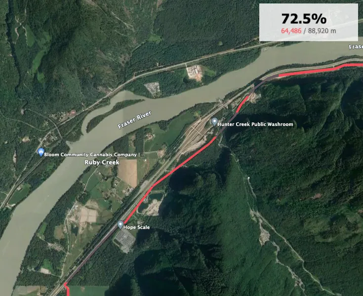
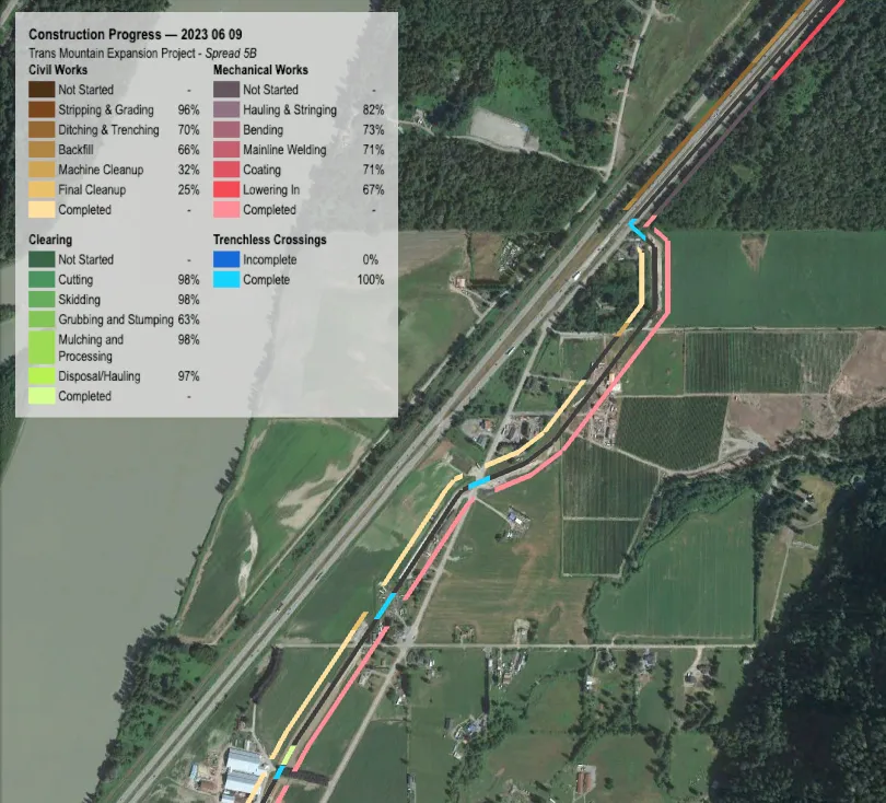
Of course, every crew can be plotted as well. In this case, I chose to group mechanical, civil and clearing crews with one another.
Outcome
These progress maps became incredibly popular on the jobsite - particulary with the client. I produced them on a weekly basis and had over 50 people approach me to request to be included on the distribution list.
Progress mapping is so valubale because it allows for roadblocks, areas of inefficiency and potential workfronts to be identified in a much more visual and clear manner than through just data alone. When paired with satellite imagery, it becomes immediately apparent that an area hasn’t been completed because of a stream crossing, rather than having to cross reference a watercourse crossing table, for instance.
Future Plans
It would be amazing to one day produce a progress-tracking application specifically for linear projects. The current offering of project scheduling software does not work very well with linear projects because it is designed for projects that are not so geographically spread out. There is no good way to link work to a physical location, and it can become quite messy trying to force it.
This mapping script would of course be a huge selling point for the application.